Guide
How to Show or Hide Chart Axes in Excel

This article will teach you how to show, hide, and change the three primary axes (X, Y, and Z) that are found in an Excel chart. In general, we’ll talk a little bit more about chart axes as well. Excel 2019, Excel 2016, Excel 2013, Excel 2010, Excel for Microsoft 365, and Excel for Mac are all covered by these instructions.
Read Also: How to Filter Data in Microsoft Excel
How to Hide and Display Chart Axes
The following steps can be taken in order to hide one or more axes in a chart created with Excel:
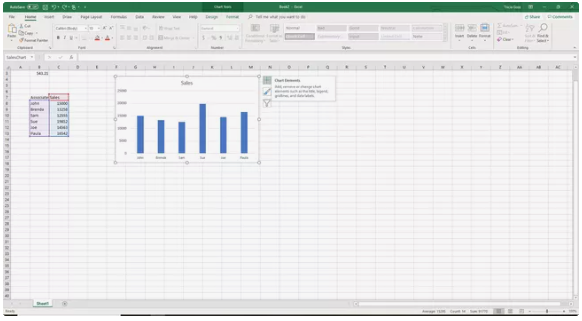
1. In order to reveal the Chart Tools that are located on the right side of the chart, you will first need to select a part of the chart that is empty.

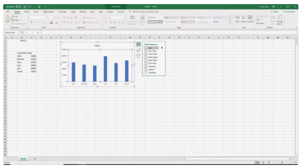
2. Click the plus sign (+) that is found next to Chart Elements in order to open the menu that is associated with Chart Elements.
3. De-selecting the check box labelled “Axes” will cause all axes to vanish.

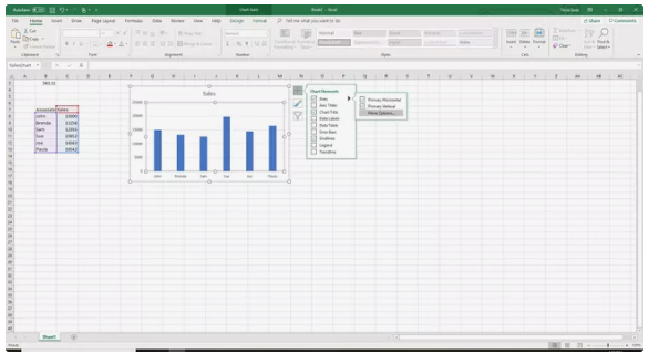
4. An arrow pointing to the right will display whenever the mouse pointer is moved over the word “Axes.” When you click on this arrow, one or more axes will be hidden.
5. You will be able to see a list of axes that can be displayed on the chart or hidden from view if you pick the arrow. This list will appear once you select the arrow.

6. Take off the checkmark from the box that is located next to the axes that you do not wish to display.
7. Put a checkmark in the boxes that correspond to the axes that you want to display on the graph.
What Is an Axis?
In Microsoft Excel and Google Sheets, a line that is either horizontal or vertical and contains units of measure is called an axis on a chart or graph. Column charts, bar graphs, line graphs, and other types of charts all have plot areas that are surrounded by axes. The axis of the chart presents the units of measure that are being used and offers a frame of reference for the data that is being displayed. The majority of charts, including column charts and line charts, include two axes that are used to measure and categorize data. These axes are as follows:
- The axis that runs vertically, often known as the Y or value axis.
- The axis that runs horizontally, often known as the X or category axis.
3-D Chart Axes
Three-dimensional charts have a third axis in addition to the traditional horizontal and vertical axes. Plotting data along a chart’s third dimension, often known as the depth, is the responsibility of the z-axis, which is also known as the secondary vertical axis or depth axis.
Vertical Axis
You can find the y-axis, which is vertical, going along the boundary of the plot area that is on the left. The data values that are displayed in the chart often serve as the basis for the scale that is used for this axis. This axis may also be referred to as the vertical axis.
Horizontal Axis
The category headings that are derived from the data in the worksheet are displayed along the horizontal x-axis, which can be found at the very bottom of the plot area.
Secondary Vertical Axis
Displaying two or more different kinds of data in a single chart is accomplished with the help of a second vertical axis, which is located on the right side of a chart. In addition to that, it is utilized to chart the values of the data.
A combination chart is an example of a chart that uses a second vertical axis to represent both temperature and precipitation data vs time in a single chart. This type of chart is sometimes referred to as a climate graph or climatograph.


