Guide
How to Add Secondary Axis in Microsoft Excel
You will learn how to add a secondary axis to a chart in Excel by reading this article. This will allow you to compare and contrast numerous data points while using the same visual representation in Excel. Reading the post will teach you how to carry out the procedure. When utilising these instructions, Excel on Microsoft 365, Excel 2019, Excel 2016, and Excel 2013 are all capable of delivering the outcomes that are required.
Read Also: How to Switch Data to a Line Graph in Excel
How to Add Secondary Axis in Microsoft Excel
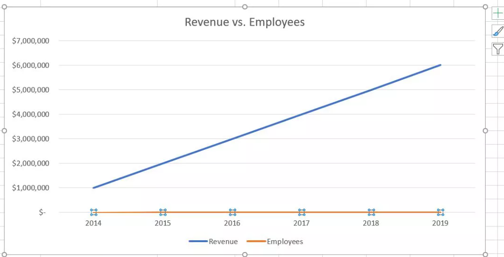
Excel’s charts provide you with a range of options for visually representing the data you’ve collected. You have the capacity to observe a series of data when charts have an X-and-Y axis layout, which enables you to compare two distinct things, but those things typically have the same unit of measure. This gives you the ability to view the chart. When comparing two things that do not utilise the same unit of measurement, it is necessary to employ a secondary axis.
1. In the beginning, choose the line (or column) that corresponds to the second data series.
2. A chart’s Chart Tools tab will become visible in the ribbon when an element on the chart is selected.
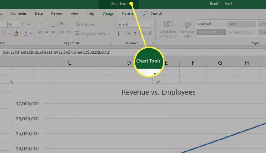
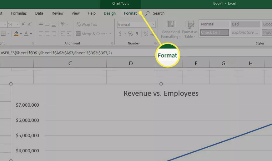
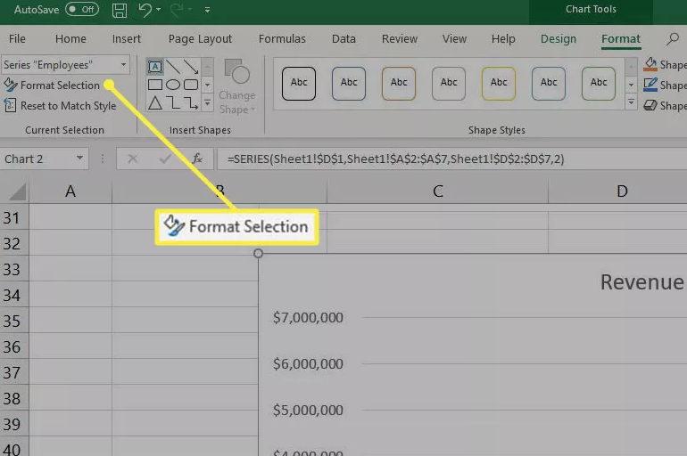
3. Choose the Format tab from the menu.
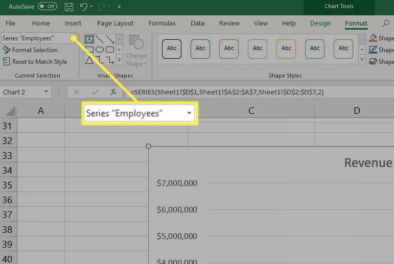
4. The series you selected should already be displayed in the Current Selection box, which is located far to the left. In this particular illustration, it is the Series called “Employees.”
5. Choose the Format you want to use.
6. Choose Secondary Axis from the drop-down menu that appears under Series Options in the panel on the right.
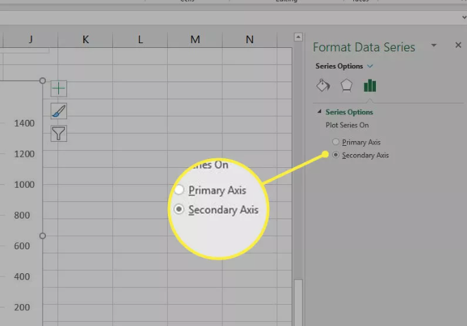
7. After it has been added, this secondary axis will have the same degree of configurability as the primary axis. Altering the text alignment or direction, providing it with a distinctive axis name, and modifying the format of the numbers are all options.
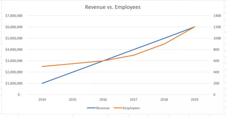
8. Now look at the chart you made. The secondary axis will be displayed on the right, and Excel will even make some educated predictions regarding the scale based on the default settings. When compared to the earlier version of this chart, the addition of a second axis makes it much simpler to examine the differences between the trends.

Vampire Crawlers Coin Farming Guide

Forza Horizon 6 Performance: Why 60 FPS Is Still the Console Standard

Yoshi and the Mysterious Book (2026) – Full Completion Guide, Rewards & Secret Ending

How to Get Free Pets in Adopt Me: A Guide for Players

Roblox Username Generator – Create a Cool & Unique Username in Seconds
How to Get Free Pets in Adopt Me: A Guide for Players

Grow a Garden Recipes in Roblox: Guide to Cook (Donuts, Sushi, Pie, Pizza & More!)
Roblox Username Generator – Create a Cool & Unique Username in Seconds
Vampire Crawlers Coin Farming Guide