Guide
How to Insert a Trendline in Microsoft Excel
If you give the information to your audience in the form of a chart that includes a trendline, which is a technique for data visualization, they will have a much simpler time interpreting the data. You will need to follow the procedures that are explained in this article in order to insert a trendline in Microsoft Excel. These methods can be found further down in the article. So let’s get started:
Read Also: How to Convert a PDF File to Microsoft Excel
How to Insert a Trendline in Microsoft Excel
To Your Chart
1. Launch Excel and navigate to the chart where you want to insert the trendline. Once you’ve done that, you can continue. If you do not already have a chart, you may make one by highlighting the cells that contain the data, and then selecting a chart type from the “Charts” group of the “Insert” tab. If you do not already have a chart, you can create one by highlighting the cells that contain the data. Make sure you select the appropriate sort of chart for the data you have.
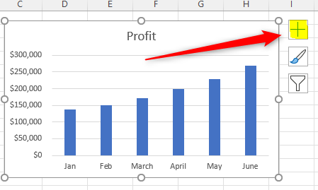
2. Once you have picked the chart by clicking it, you will notice that a “Plus” symbol will appear to the right of the chart. Clicking this symbol will allow you to add additional data to the chart.
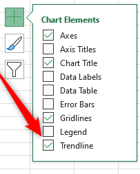
3. Select the checkbox that is situated next to “Trendline” in the drop-down menu that is titled “Chart Elements,” and then click “Apply.” As soon as you check the box, the trendline will begin to appear on the chart that you are looking at.
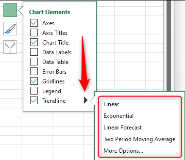
4. By default, the trendline with the label “Linear” is inserted. If you need a different kind of trendline, move your cursor over the word “Trendline,” click the right arrow that appears when you do so, and then choose a trendline style from the sub-menu that displays. If the sub-menu does not contain the style that you are looking for, pick “More Options” to view the available extra styles.
5. When you have finished adding the trendline to your chart, you can then format it so that it remains consistent with the general layout of the spreadsheet.
FAQs
How do you find trend line?
How does one determine where the trend line should be drawn on a graph? A trend line represents a relationship that is linear in nature. y is the dependent variable, x is the independent variable, m is the slope of the line, and b is the y-intercept. The equation for a linear relationship is y = mx + b, where m is the slope of the line and b is the y-intercept.
What is a trendline on a graph?
A line that is placed on a chart to show the general direction in which the data is moving is called a trendline. Scatter Charts, Bar Charts, Column Charts, and Line Charts are all chart types that can have trendlines automatically generated by Google Charts. There are three distinct kinds of trendlines that may be drawn using Google Charts: linear, polynomial, and exponential.
Which trendline is best?
When dealing with simple linear data sets, a straight line that best fits the data is called a linear trendline. If the pattern in your data points looks like a line, then you have what’s known as linear data. In most cases, the presence of a linear trendline indicates that the value of something is growing or shrinking at a constant rate.
Is trendline same as trend?
Traders frequently draw trendlines in order to improve their awareness of the trend and better determine at what prices to enter and exit a trade. The beginning of a trend is where a trendline begins, and the conclusion of the trend is where it ends. When the direction of the trend changes, a new trendline needs to be drawn to accurately represent the new direction of the trend.

Roblox Username Generator – Create a Cool & Unique Username in Seconds

Grow a Garden Recipes in Roblox: Guide to Cook (Donuts, Sushi, Pie, Pizza & More!)

Job Opportunities in Dubai – 2026

Mr Bit at the SBC Awards Europe 2025: The Bulgarian Brand Setting New Standards in the European Gaming Industry

Dennis Rodman Net Worth 2026 – Everything You Need to Know

Bloxburg Neighborhood Codes 2026
Grow a Garden Recipes in Roblox: Guide to Cook (Donuts, Sushi, Pie, Pizza & More!)
Job Opportunities in Dubai – 2026
Dennis Rodman Net Worth 2026 – Everything You Need to Know