Guide
How to Make a Bar Graph in Microsoft Excel

A bar graph is a type of chart that displays data as horizontal bars that are plotted along two axes. When the titles of the categories are longer, such that they might extend to the left, this can be helpful. In addition, there are numerous variations of bar graphs that can be utilised for various kinds of data.
For instance, if you have several different kinds of data in each category, you can use a clustered bar to display it side-by-side in a single category, or you can use a stacked bar to depict individual data points as pieces of a whole. Both of these bar types can be found in graphing software. You can also select a three-dimensional chart to give the graph some additional aesthetic richness.
When you are trying to build a visual representation of a data range in Excel, you may choose from a variety of graph alternatives that are reasonably simple to produce. The procedure is as follows:
Read Also: How to Multiply Two Numbers in Microsoft Excel
How to Make a Bar Graph in Microsoft Excel
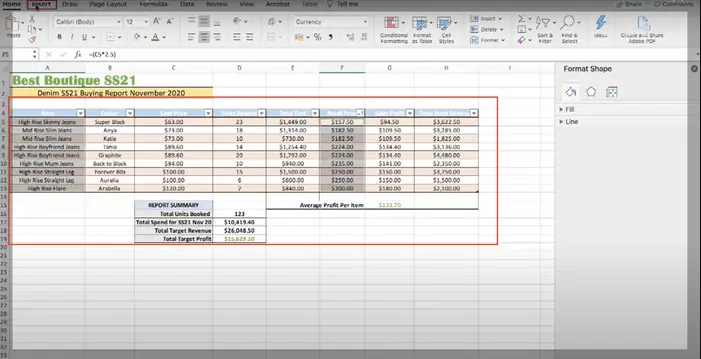
Start by launching the Excel programme and navigating to the spreadsheet from which you’ll be getting the data. Before you can construct the bar graph, it has to have a variety of data to choose from.
1. Call attention to the spectrum of the facts you intend to represent. You have the option of either clicking and dragging for many columns that are adjacent to one another.
2. To pick columns that are not immediately adjacent to one another, first choose one column, then press and hold Control while dragging over the column you wish to select.
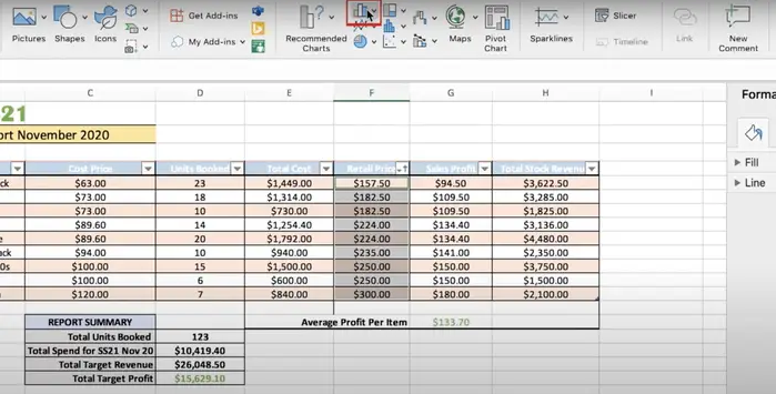
3. Navigate to the top toolbar and select “Insert.” Then, within the Charts group, select the icon that looks like a bar chart.
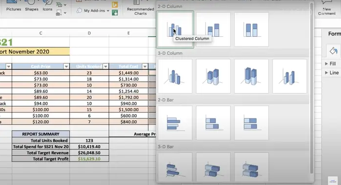
4. Head on over to the “2-D Bar.” There is also an option underneath it to generate the bars in “3-D,” which will give your chart a greater sense of three-dimensionality.
5. Your data can be shown as clustered or stacked within any form of graph you choose to use. The first option will display each category using two bars side-by-side, while the second option will combine all of the data to create a single bar with multiple colours for each category. Move the pointer over the option that you would like.
6. Select the type of bar graph you wish to use by clicking on it. Because your graph is now a part of your document, the graph menu will no longer be available to you.
7. To modify the name of your graph, go to the top of the chart and click on the text that says “Chart Title.” By clicking on the category names along the X and Y axes, you may easily change the names of the categories.
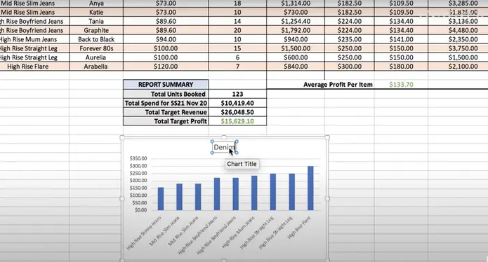
Either keep the finished bar chart right in the spreadsheet where it was created, or use the drag and drop functionality to move it to a new sheet. When you are done, make sure you hit the “Finish” button.
FAQs
How do I create a bar chart in Excel with multiple groups?
After selecting the table, head to the Insert menu and after clicking on Recommended Charts, choose the Clustered Column Chart from the drop-down menu that appears. The chosen data will be presented in the form of a clustered chart, with individual bars being generated for each year and every three months.
What is a simple bar graph?
A straightforward bar graph is a graphical depiction of a particular data collection in the form of horizontal and vertical bars. On the graph, the size of the category that each bar symbolises is proportional to the magnitude of that category. The primary objective of a bar graph is to facilitate statistically valid comparisons of different amounts or categories of information.
Why do we use bar graphs?
In both presentations and reports, bar graphs are a highly useful and effective visual aid to use. They are common because the reader is able to spot patterns or trends far more simply than when reading at a table of numerical data. This is one reason why they are so popular.

Vampire Crawlers Coin Farming Guide

Forza Horizon 6 Performance: Why 60 FPS Is Still the Console Standard

Yoshi and the Mysterious Book (2026) – Full Completion Guide, Rewards & Secret Ending

How to Get Free Pets in Adopt Me: A Guide for Players

Roblox Username Generator – Create a Cool & Unique Username in Seconds
How to Get Free Pets in Adopt Me: A Guide for Players

Grow a Garden Recipes in Roblox: Guide to Cook (Donuts, Sushi, Pie, Pizza & More!)
Roblox Username Generator – Create a Cool & Unique Username in Seconds
Yoshi and the Mysterious Book (2026) – Full Completion Guide, Rewards & Secret Ending