Guide
How to Make a Logo in Photoshop
Before we get started on how to create a logo in Photoshop, we need confront the elephant in the room: Photoshop CC was not designed with logo creation in mind when it was originally released. One of the most important characteristics of a logo is its ability to scale up and down without losing any of its beauty. As a result, vector-based software, such as Illustrator, is the ideal alternative for producing logos, whereas Photoshop’s pixel-based structure is less appropriate. Check out this helpful tutorial for more information on creating a logo in Illustrator. It will walk you through the entire process, from concept to completion.
Although Photoshop does not have as many applications as Illustrator CC, it more than compensates for this by being more popular than the latter. In other words, if you want information on how to create a distinctive logo but do not wish to pay for software that you do not use this lesson is for you. We’ll show you how to create a simple logo in Photoshop, utilizing simple shape tools, gradients, and text choices to get the desired result. If you look into these choices, you will soon find yourself creating your own logos in Photoshop in no time! We’ll be using Photoshop CS6, but the procedure is the same for previous versions of the software.
In order to develop your own logo, you may need to start thinking about brand identification and style early on in the process. For even more ideas, check out our how-to tutorial on how to design a logo, which will teach you all you need to know about the world of logo design.
Read Also: How to Exit 3D Mode Photoshop
How to Make a Logo in Photoshop
1. Create a new canvas
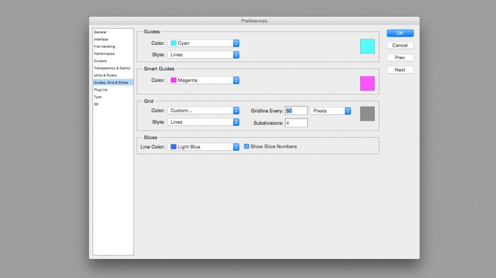
Create a new document in Photoshop by clicking on File > New Document. Larger canvas sizes would also work well, and I utilized a 500px by 500px canvas size for my project. You have the option to modify the canvas size at any time. To create a gridline every 50px, go to Photoshop > Preferences > Gridlines. Then, on the canvas, switch on the grids by hitting cmd +’or by selecting View > Show from the Options menu. Check that Snap to Grid is enabled in the View > Snap to drop-down menu.
2. Draw a basic shape
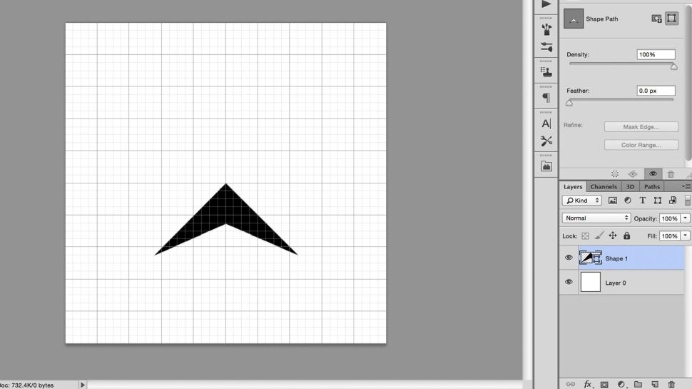
Make sure the Pen tool is selected in the toolbar or by hitting P on the keyboard, and that it is set to Shape rather than Path in the left-hand side of the Options bar. Create an arrowhead form with the pen, starting at the centre of the canvas and connecting it with grid-line intersections for the rest of the points. Even though naming the levels is not required for this project, it might be beneficial in more involved projects with several layers.
3. Duplicate and edit the shape
Using Command + J to duplicate a layer, pick the new layer by clicking on it in the Layers panel. To choose the top-most point of the arrowhead, which is placed in the centre of the canvas, use the Direct Selection tool (shortcut A) and click on it. Move this point a few grid squares along the y-axis while holding down the Shift key to keep it fixed on that axis.
4. Add colour with a gradient
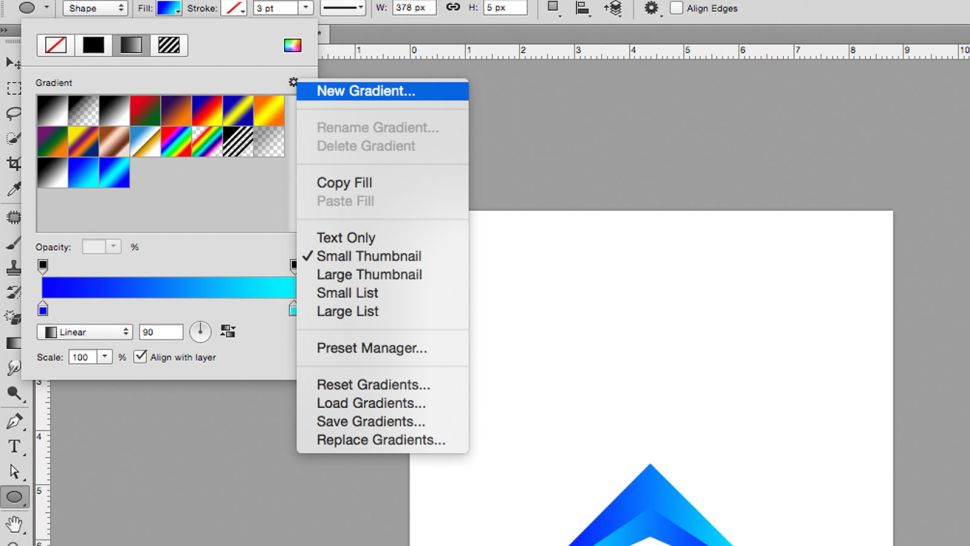
Create a new gradient by selecting it from the Fill drop-down menu, which is located to the left of the Options bar. Double-click on the bottom sliders in the gradient window to bring up the RGB settings box, where you can pick your colours; I opted with a light and dark blue for my gradient. Afterwards, apply this gradient to both objects, reversing the gradient rotation such that they are in opposition to one another. If you are unable to view the Fill choices, it is possible that you have the Move tool chosen. If this is the case, switch to the Pen or Shape tool.
5. Group and duplicate your layers
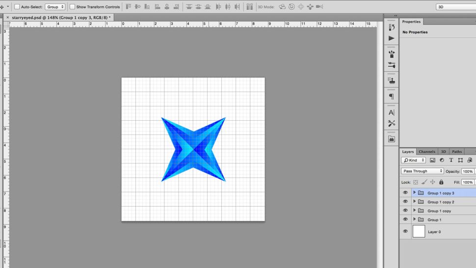
By choosing the two layers and tapping the group button, which looks like a little folder and is situated at the bottom of the Layers tab, the two layers will be combined. This keeps the Layers tab from becoming cluttered and makes it easier to work with the two layers when they are combined.
Using the Free Transform feature, duplicate this group and rotate the new group ninety degrees while holding down the Shift key to rotate in fifteen-degree intervals. Free Transform may be accessed by pressing the keyboard shortcut cmd + T or by selecting Edit > Free Transform. Continue moving the second group up until it resembles the original shape while maintaining symmetry by using the centre of the canvas as a guideline.
6. Transform the shapes
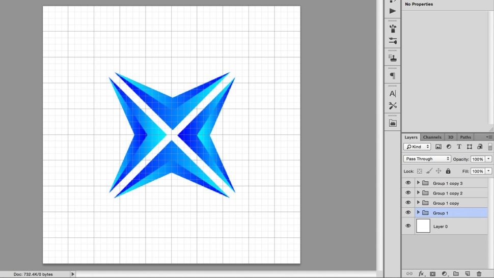
Using the Shift + cursor key, move each form one grid square away from the centre point, up or down one grid square.
7. Group, duplicate, repeat
After grouping the layers together with the same way as in step #5, make a copy of the group and rotate it 90 degrees. Ideally, the new design will mimic some kind of crosshair shape.
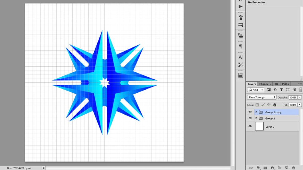
8. Draw a circle with the shape tool
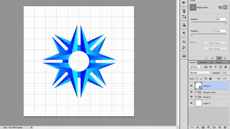
Either by clicking-and-holding on the Shape tool icon in the toolbar or hitting Shift + U, cycle through the various Shape tools until you come on a circle. Press Alt while clicking on the centre point of the canvas, and then Shift to maintain the width and height proportionate while drawing a circle radiating from the centre point. It is possible to undo or re-edit your shape if you make a mistake when working with Free Transform.
9. Draw a rectangle and align to the centre
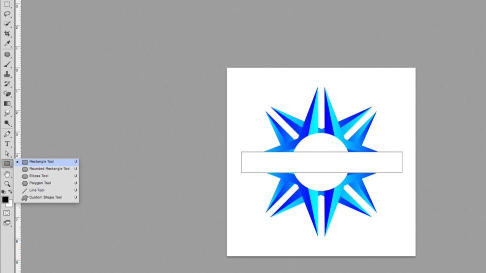
Continue to cycle through the form tools until you come to the rectangle tool. Create a white box across the top of the design, above the other layers, to allow for text to be added. In order to align this to the centre of the canvas, click on the rectangle layer and the bottom layer (both of which should be a white square of equal size to the canvas) and then use the align tools, which can be found under Layers > Align in the Menu Bar or by pressing the align buttons in the options bar.
More sophisticated users may use this rectangle to deduct from the forms below by selecting Layer > Combine shapes, but for the time being we will just continue to utilizing it as a white block in our illustration.
10. Add your text
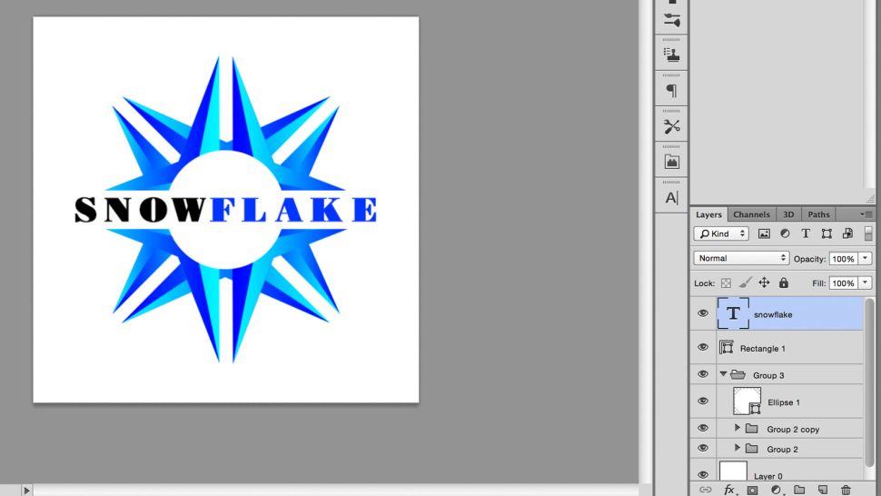
Create a text box over the rectangle by clicking on the T symbol in the toolbar or hitting T on the keyboard, then dragging over the canvas with your mouse. Make use of the buttons on the Character tab to centre your text once you’ve typed it into the box. To centre this on the canvas, use the align tool once more to centre it.
11. Choose an appropriate typeface
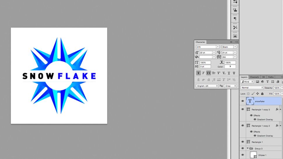
Select a typeface that is appropriate for your company’s image. There are a plethora of free fonts available, but it is critical to choose one that has been granted permission to be used – read our free fonts compilation for some inspiration. Because this logo may appear across a variety of your assets, using a typeface that has been illegally obtained would be a terrible idea. Experiment with different sizes and colours until you find something you like.
12. Adjust your kerning
Kern the text, if you will. This entails changing the horizontal space between individual letters in order to increase the readability of the word. If you want to do this, go to the Type tab, which is labelled with the letters V | A, or click between the letters and hit alt + left or alt + right.
13. Add final details and export
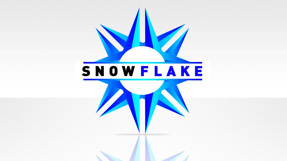
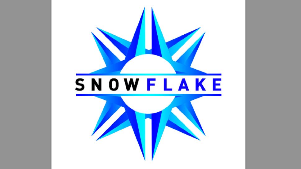
Make any last modifications that you think are necessary to give it that particular touch. For the primary picture at the top of this page, I added two smaller bars above and below the text, both of which were coloured with the same gradient as the text. Background, shadow, and reflection were all generated using techniques identical to those used in the previous phases, as well as utilizing layer masks to create a fading effect.
As soon as you’re satisfied with the image, save it in the format that you desire. Here, I used RGB jpg for web format, but I also saved it as Photoshop PSD so that I could go back and make modifications later.
Video

Roblox Username Generator – Create a Cool & Unique Username in Seconds

Grow a Garden Recipes in Roblox: Guide to Cook (Donuts, Sushi, Pie, Pizza & More!)

Job Opportunities in Dubai – 2026

Mr Bit at the SBC Awards Europe 2025: The Bulgarian Brand Setting New Standards in the European Gaming Industry

Dennis Rodman Net Worth 2026 – Everything You Need to Know

Bloxburg Neighborhood Codes 2026
Grow a Garden Recipes in Roblox: Guide to Cook (Donuts, Sushi, Pie, Pizza & More!)
Job Opportunities in Dubai – 2026
Dennis Rodman Net Worth 2026 – Everything You Need to Know