Guide
Making Medical Device Interfaces More User-Friendly
It is no wonder that medical device makers spend many months or even years developing a preliminary user interface design for their products. The trick is that a product’s user interface can become its Achilles’ heel, particularly if its rival has previously released a more user-friendly product. The competition is tough, and design development for medical devices is associated with multiple risks and challenges. To make things easier for you, we want to share with you the key tricks aimed at helping you solve design challenges. So keep reading and plan design development smartly.
Reduce Screen Density
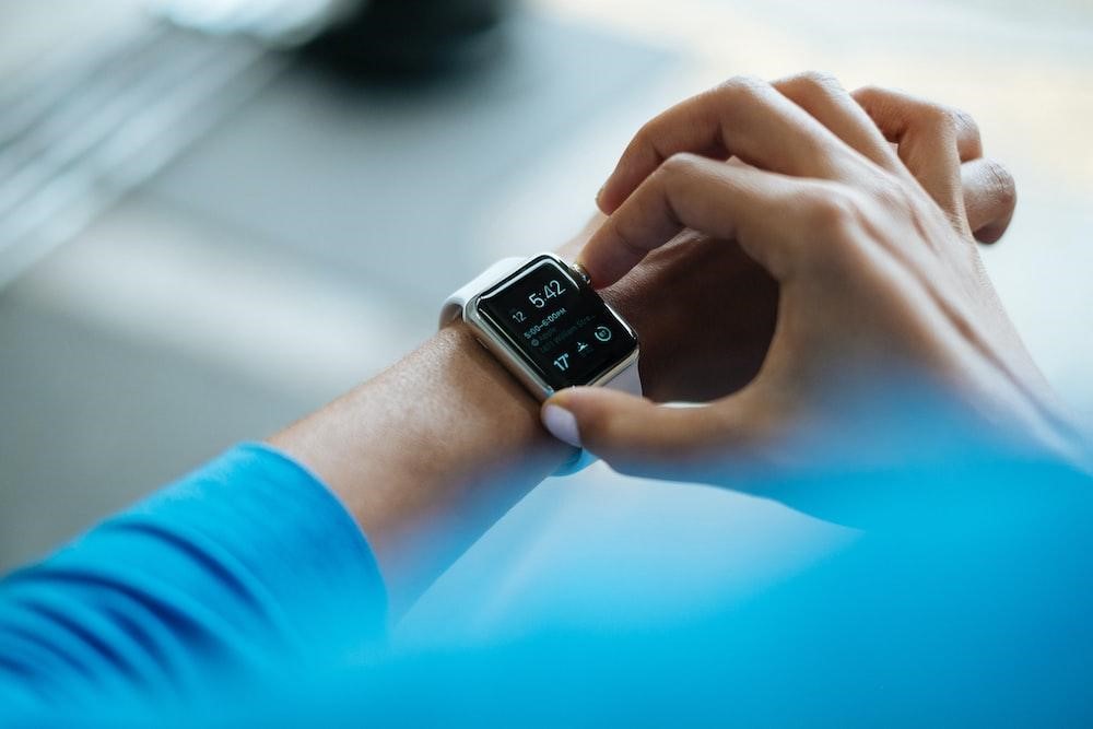
Many medical equipment displays seem to be loaded with lots of information and controls, with little free space remaining. In a medical device user interface design, such space is crucial since it serves to split information into relevant groups and offers a resting area for the user’s sight. Overly dense-looking user interfaces may look confusing, making it difficult to pick out precise information at a glance. To remove unnecessary information, the user-interface designer can:
- Display supplementary information in pop-ups or move it to other screens as needed;
- Reduce the size of brand identification images (such as logos and brand names);
- Use simpler images (for example, replace 3-D icons with silhouettes);
- To divide text, use empty spaces rather than lines;
- Reduce the quantity of words by simplifying your statements.
Group and visualize data effectively to ensure a smooth user experience and journey.
Provide Navigational Indicators
Moving from one place to another on a medical device user interface might be confusing. We can compare this experience to driving in an unknown city with no road signs or signs written in a foreign language. Sometimes the difficulty stems from the user’s inability to find themselves inside the user-interface hierarchy.
To prevent this from happening, it will be a good idea to use a header to provide significant titles on each screen and subcomponent (e.g., message boxes and important components). The reader might also benefit from numbering the pages of an electronic text. Navigation controls and choices, such as “Go to the main menu,” “Go back,” “Previous,” “Next,” and “Help,” should be placed together in a single, consistent position so that users can simply return to a previous screen or cancel an action without becoming lost.
Reduce the Number of Colors
Experienced designers recommend that the user interface’s color pallet should be limited. The backdrop and primary on-screen components should be limited to three to five colors, including grayscale, while unique and small-scale features may use additional hues. A user interface designer should also carefully pick colors to ensure that they are compatible with medical norms. For example, red is widely used to convey warning information or arterial blood pressure data, and other secondary colors are connected with certain medications.
Make Typography Simple
A good user interface is built on typographic conventions that direct users to the most relevant information first and make screen material simple to read. A user-interface designer often commits to a single typeface and a few character sizes such as 12-, 18-, and 24-point type to accomplish these outcomes. While characters’ proportions should vary, the disparities should not be so great that they generate a strong visual contrast.
Excessive highlighting, such as underlining, bolding, and italicizing, is another approach to simplify typography. When combined with varied font sizes and additional line spacing, a single approach such as bolding is usually sufficient to emphasize content effectively.
Final Say!
The success of most medical equipment is inextricably connected to the quality of the user interface. This is especially true about medical devices and a healthcare industry, where significant market rivalry exists and the related technology develops. All this makes user-interface quality a key determinant in product success. That’s why we strongly recommend that you invest enough time and resources in the development of a user-centric design for your medical device. Only in this case, you can be sure that it bypasses competitors and is used by a target audience.

Vampire Crawlers Coin Farming Guide

Forza Horizon 6 Performance: Why 60 FPS Is Still the Console Standard

Yoshi and the Mysterious Book (2026) – Full Completion Guide, Rewards & Secret Ending

How to Get Free Pets in Adopt Me: A Guide for Players

Roblox Username Generator – Create a Cool & Unique Username in Seconds
How to Get Free Pets in Adopt Me: A Guide for Players
Yoshi and the Mysterious Book (2026) – Full Completion Guide, Rewards & Secret Ending
Forza Horizon 6 Performance: Why 60 FPS Is Still the Console Standard