Guide
How to Make a Line Graph in Excel

Excel provides users with a selection of graphs to choose from when it comes to projecting data. Because each graph possesses its own unique characteristics, it is essential that the data be presented using the appropriate graph.
In a similar vein, line graphs are utilized to display patterns in the form of a line. A single or numerous series of data can be displayed in a line graph at the same time. Excel has a variety of line graph types, each of which has additional customization options available to the user.
Read Also: How to Add Error Bars in Excel
Types of Line Graphs in Excel
- Line: The basic line graph will plot the data with a simple line. If you have multiple series of data, they will be plotted on the same canvas with an independent line.
- Stacked Line: Displays the first data series as it is, and then sums the other data series with the previous ones then displays them. With this graph, Excel will project the lines on top of each other and the final data series will display the sum of all data series. The stacked line graph only works when you have more than one data series. If you use it to display a single data series, it will be no different from the basic line graph.
- 100% Stacked Line: Works the same as the stacked line graph, except that the sum of the values from all data series will equal 100%. The difference between a line and the one below it will display what proportion of the 100% total belongs to that data series. Like the stacked line graph, you should use the 100% stacked line graph when you have more than one data series, or it will be a single line at 100%.
How to Make a Line Graph in Excel
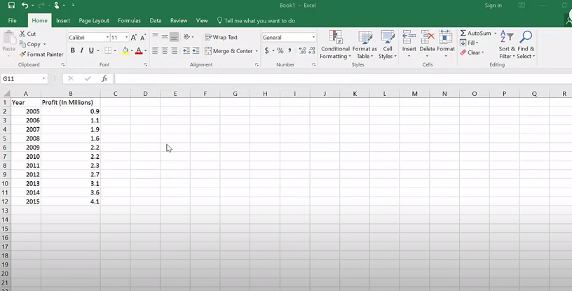
Let’s get started with graphing by looking at a basic example. This sample data sheet provides information regarding the population of Canada from the years 1990 through 2019. Since the years are going to be the categories for this graph, the space in cell A1 should be left blank. In the event that this is not done, Excel will interpret the years as numbers rather than labels, which will result in an inaccurate graph.
To generate a line graph in Excel:
- Choose the cells from A1 through B8. (You can do this by selecting A1 and then dragging your mouse cursor over to B8. Alternately, you can pick A1, then B8 while simultaneously holding down the Shift key on your keyboard.
- Locate the Insert tab on the ribbon at the very top of the page.
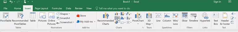
- In the Charts section, choose the icon that looks like a line chart. This will bring up a menu with all of the different types of line charts. When working with Excel, the terms graph and chart are used interchangeably.
- Choose the Line with Markers option from the menu.
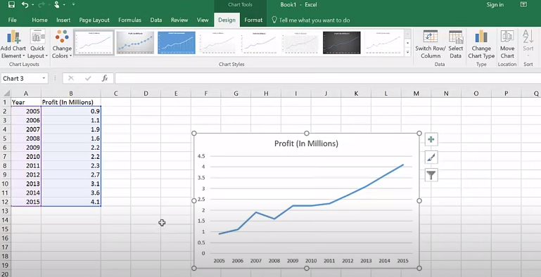
- Excel will now create a line graph with markers based on the data you provided.
FAQs
Which data use for line chart in Excel?
Line Chart. Line charts are an effective way to illustrate trends as they develop through time. If you need to display text labels, dates, or a small number of numeric labels down the horizontal axis, you should use a line chart. Use a scatter plot (XY chart) to demonstrate scientific XY data.
What should you not use a line graph for?
Even if there aren’t many hard-and-fast rules when it comes to data visualisation, there is one thing that can be said with absolute certainty: line charts should not be used when comparing many categories at the same point in time for a single variable.
What does a line chart represent?
Key Takeaways
A line chart is a sort of chart that presents information as a sequence of data points connected by straight line segments. This type of chart is also known as a column chart. A line chart is a type of chart that visually represents the price history of an asset by utilising a single line that does not break.
What are the lines in a graph called?
Putting Together a Graph Made of Lines
Line graphs have two axes: the x-axis (which is horizontal) and the y-axis (which is vertical) (vertical). Each axis corresponds to a unique category of data, and the information contained at the spots where the axes intersect is (0,0). Because its values are not reliant on anything that is being measured, the x-axis is considered to be the independent axis.
What is multiple line graph?
A line graph that is plotted with two or more lines is referred to as a multiple line graph. It is utilised to illustrate two or more variables that fluctuate throughout the course of the same period of time. In most cases, the independent variable will be located on the horizontal axis, while the two or more dependent variables will be located on the vertical axis.
What makes a line graph effective?
When you want to depict how the value of anything varies over time or compare how the values of numerous items change over time relative to each other, the ideal type of graph to use is a line graph (also known as a line chart). If you hear the essential phrase “across time,” that is your cue to think about creating a line graph for your data. When you hear that phrase, pay attention.

Vampire Crawlers Coin Farming Guide

Forza Horizon 6 Performance: Why 60 FPS Is Still the Console Standard

Yoshi and the Mysterious Book (2026) – Full Completion Guide, Rewards & Secret Ending

How to Get Free Pets in Adopt Me: A Guide for Players

Roblox Username Generator – Create a Cool & Unique Username in Seconds
How to Get Free Pets in Adopt Me: A Guide for Players
Yoshi and the Mysterious Book (2026) – Full Completion Guide, Rewards & Secret Ending
Forza Horizon 6 Performance: Why 60 FPS Is Still the Console Standard